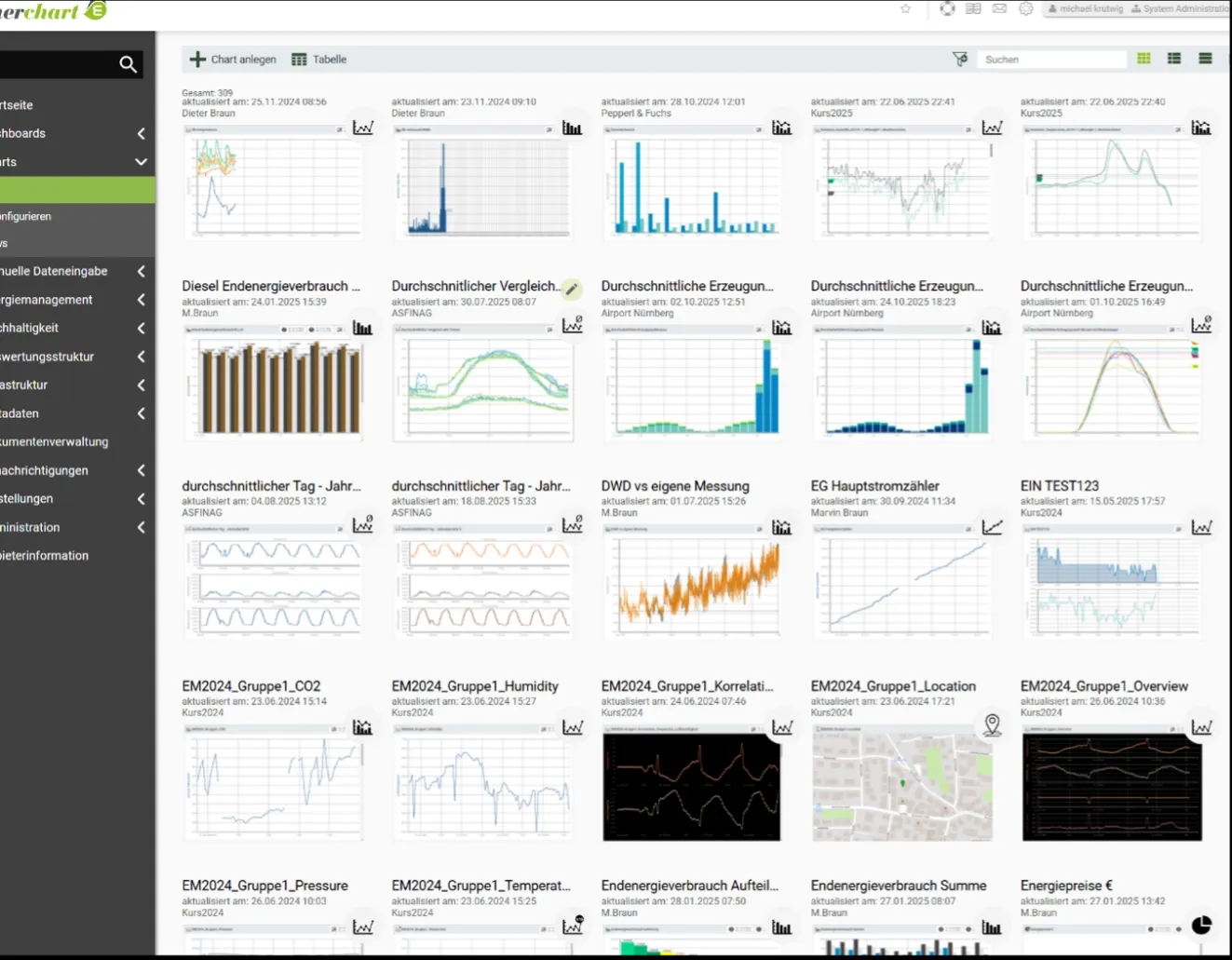
Monitoring and Visualisation Tools / enerchart Visualisation Features
Interactive charts and dashboards for exploring energy, resource and operational data. Pilot-data connections are under development.
Live charts, dashboards, KPIs and state indicators.
Interactive chart exploration with zoom, movement and multiple display options.
Dashboards for energy, KPIs, material flows and other time-series states.
Freely placeable dashboard elements with drag/drop and layout customisation.
CSV/XLSX export of chart data.
Automatic dashboard conversion to PDF and e-mail delivery.
Threshold violation alerts and plausibility/gap checking.
Visualisations use the datasets and service outputs made available through the configured interfaces. Each displayed series or indicator needs a defined meaning, unit and reporting interval. Dashboard configuration determines which measurements and comparisons are presented to each audience. Example datasets support demonstration of the interface, while operational views depend on the corresponding pilot-data connections.
Dashboard layouts and visualisation features are being developed for the regional circular-economy ecosystem. Current demonstration views use example data. The monitoring and visualisation components provide configurable web interfaces for exploring CSSBoost data and service outputs. Dashboards and graphical views are intended to help pilot operators and other stakeholders understand operational patterns, compare indicators and navigate information about a regional circular-economy ecosystem. The CSSBoost reference demonstrator has been implemented and deployed as a web-based entry point for these functions. A documented JSON-based API supports structured access to the data and services used by the visualisation layer, together with a user handbook for integration and use. This creates a basis for adding further visual components and stakeholder-specific views. Development continues with pilot-specific dashboards and widgets. Work has also started on a standardised AI interface using the Model Context Protocol to support additional forms of interaction and exploration. These extensions remain under development. The visualisations present the information supplied by connected sources and services, so their interpretation depends on the measurement definitions, reporting intervals and assessment context behind each displayed value.
Connect pilot data sources and validate visualisations and indicator calculations.
Agreed pilot datasets, indicator definitions, source mappings, units and update schedules.
Configured dashboard layouts and example visualisations for energy, resource and operational indicators.
Integration interfaces and pilot-data connections are under development.